


The goal of Vintage Vines was to practice and refine my skills in brand identity and packaging design through a conceptual case study. I wanted to challenge myself by creating a cohesive visual brand that felt both elegant and professional, while experimenting with typography, layout, and product presentation. This project provided an opportunity to improve my design process, from initial concept sketches to final digital mockups.
Brand Strategy | Brand Design | Packaging Design
Project Goal
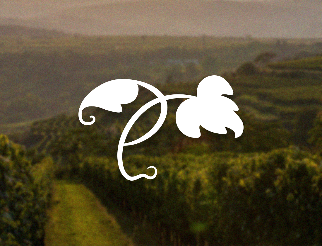

Subtle inclusions of vines have been left within the logotype (on the 'V') I focused on blending a modern style with a timeless, rustic feel using serif typefaces. To make the company stand out amongst competitors I wanted to stray from traditional wine red colours and use a rich burgundy that still ties in with the industry. A sub mark icon was also created to enable the brand to be scalable.
Design Decisions


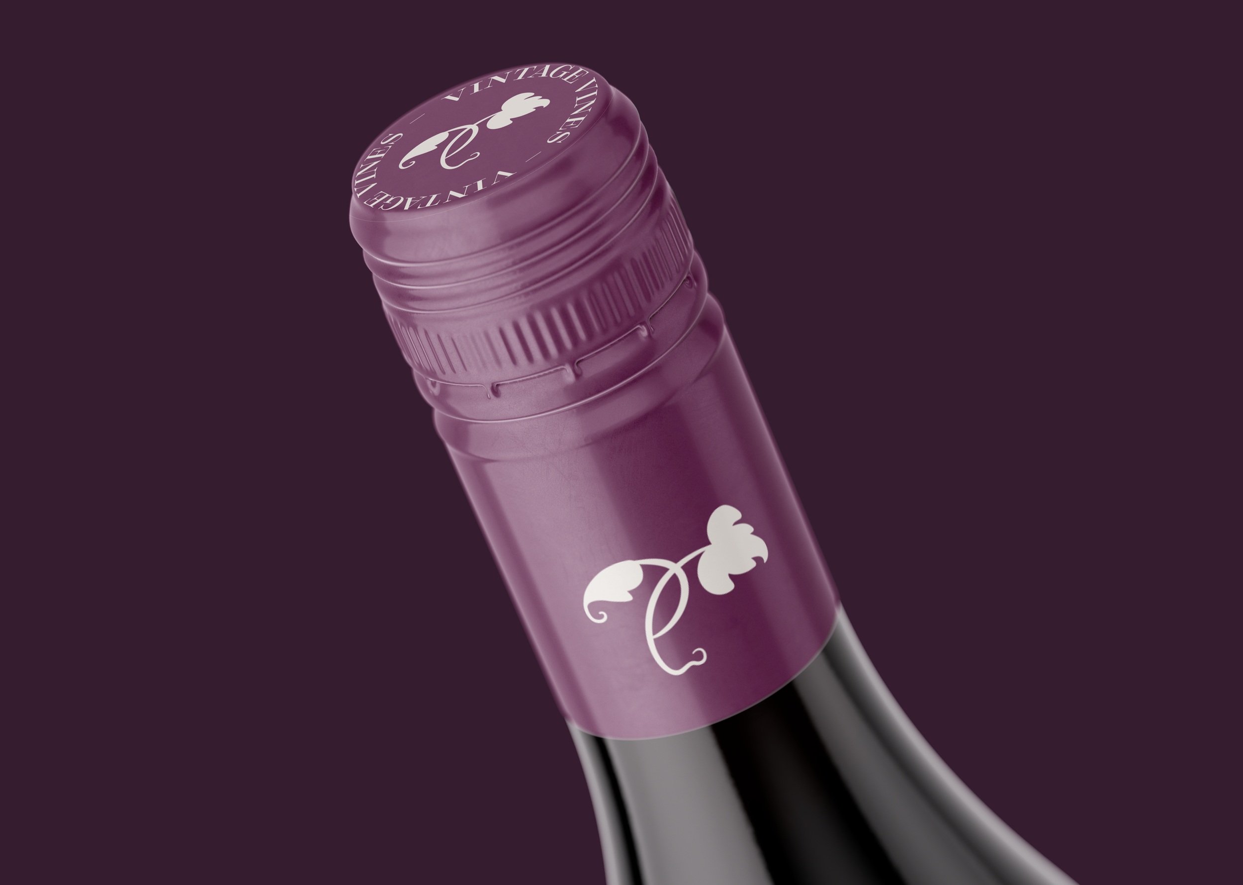
I conducted market research to determine current trends and labelling practices within the wine industry. I observed that most packaging is cluttered and hard to read at a glance. For this reason, I focused on creating a simple and easy to read label.
Packaging Decisions

